Truly Scrumptious Cakes Logo
To create the logo for my client, I relied mainly on the work I did while studying Concept Art for Games and Film, at Staffordshire University.
This is the process I used to get to the final design, all with thorough discussions between myself and the client.
Consider following https://www.facebook.com/103517545159709/ as well!! Her stuff is divine! 
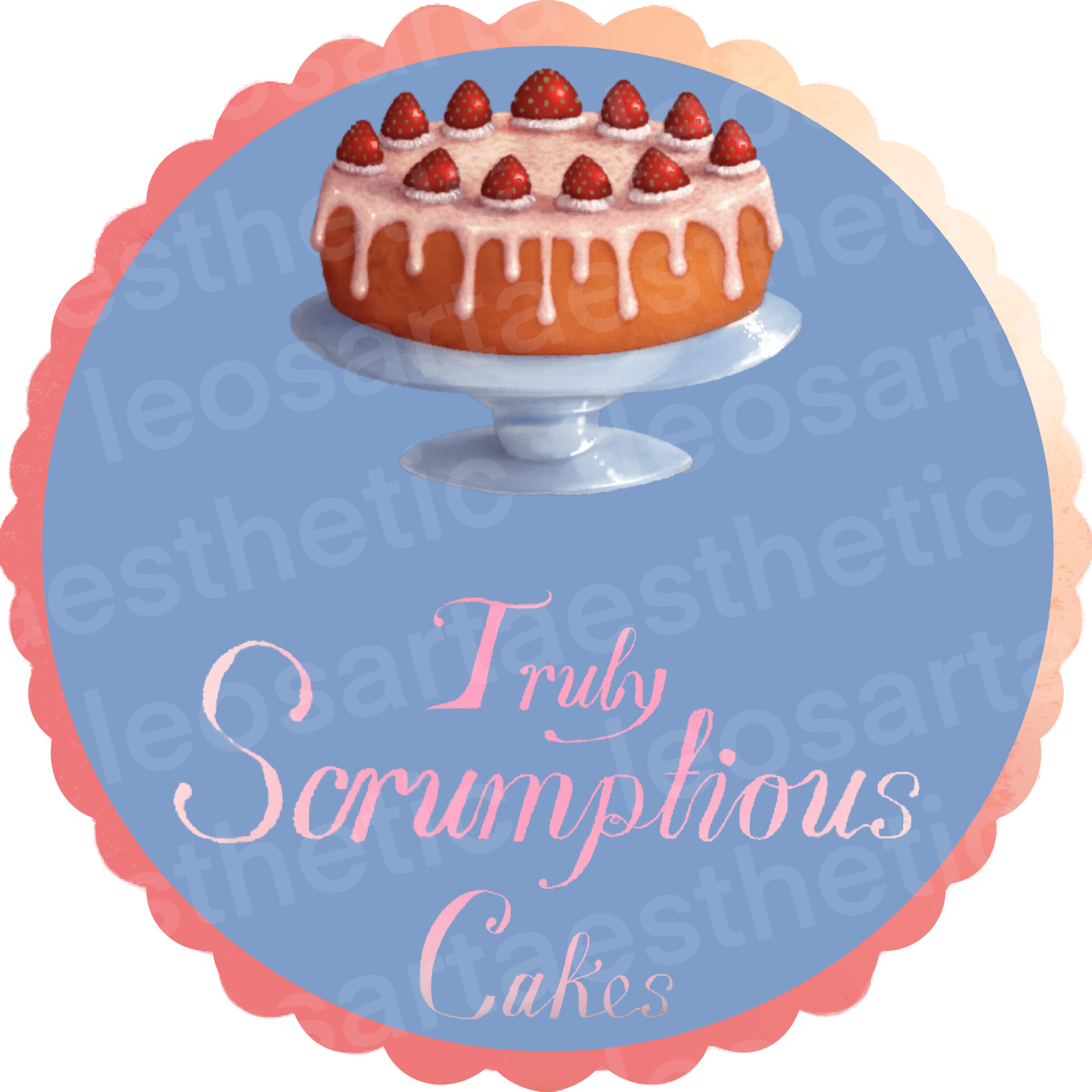
The Final Logo, as chosen by the client.

Some font work. I wanted to create a font rather than simply typing it out.

These are a few of the text placements and logo shapes I tested.

Next was the design of the cake on the logo. I wanted to give the client some variety with the cakes, from some more intricately designed ones to more simple designs.

Next was the style mock ups. These were mostly based off of logo designs I had seen in my research prior to starting this assignment.

After rendering the cake I wanted to have some colour mockups for it. I thought of the kinds of cakes my client already sold and the kinds of icing that may compliment each cake colour. In the end the client selected the second iteration.

Some colours, based on the client’s request on colour usage. Pinks, blues and yellows were common themes in bakery logos, so I utilised those here. The colours behind the text and cakes were reminiscent of other logos my client had picked at for inspirati

Lastly the final mockup for the logo. I thought some embelishment of the outer circlce for the log would add a bit of flair to it, and the client was pleased with them all but ended up going for number 4.